Hold up, what is PWA?
So the first thing you should know about PWA (or progressive web apps) is that it’s an adaptation of your current site or web app. This means that if you want to have all the features of a progressive web app, you are going to need to change your current site/application. The good news here is that they are all changes you would want to have anyway.
PWA turns your site/application into something that feels like a native application on supported mobile browsers (this is mostly Chrome on Android at the time of writing). Making your application feel more native includes offline access, an app icon on the homescreen, an app like interface (you can choose to hide the navigation bar) and a lot more.
What is needed to make this happen?
For this I’m going to steal some information from the developers.google pages:
- Progressive – Works for every user, regardless of browser choice because it’s built with progressive enhancement as a core tenet.
- Responsive – Fits any form factor: desktop, mobile, tablet, or whatever is next.
- Connectivity independent – Enhanced with service workers to work offline or on low-quality networks.
- App-like – Feels like an app to the user with app-style interactions and navigation because it’s built on the app shell model.
- Fresh – Always up-to-date thanks to the service worker update process.
- Safe – Served via HTTPS to prevent snooping and to ensure content hasn’t been tampered with.
- Discoverable – Is identifiable as an “application” thanks to W3C manifest and service worker registration scope, allowing search engines to find it.
- Re-engageable – Makes re-engagement easy through features like push notifications.
- Installable – Allows users to “keep” apps they find most useful on their home screen without the hassle of an app store.
- Linkable – Easily share via URL, does not require complex installation.
That looks like a lot of work right?
In reality most of this is not really new. Your site should already be responsive, be served over https, linkable etc.
The others things are easily added.
Ok, let’s do this. How do we start?
Well I had the same question… Most of those things above are front-end things, and front-end was a name I haven’t heard in a long long time. So I called in our resident front-end guru Sam who helped me through it.
So first up is installing Lighthouse, this is a chrome plugin, created by the friendly people at Google that checks the site you are currently visiting for compliance with the list above and returns not only a score but also some pointers on what to improve.
We’ve decided to run it against our own site (note: you’re currently reading our blog which is decoupled from our company site) and this is what we got.
So if you don’t want to check out the entire report, let’s go over some highlights first. First of all is the score.

46/100 is not really great, but at least we already covered some stuff.
Ok, so what are the major areas for improvement here?
We seem to miss these things related to a manifest, a “Service Worker” and some misc server/css stuff.
What is a manifest?
A manifest is some meta data about your website. One of the cool things this allows you to do is make it possible for Android phones (and maybe in the future other OS’s) to add a shortcut to the home screen that makes the app feel like a native app.
Time to make a manifest! This is what we ended up with. (don’t forget to link it in your HTML)
As you can see, this is not really complicated. Let’s take a quick look at the fields:
short_nameis the name that will appear under the icon on the homescreen.nameis the longer name that will be used in communication screens.iconsis a collection of homescreen icons in different sizes.start_urlis the relative url the app should open on launch.displayis the feeling the app should have, we set it tostandaloneso the app has a native feeling.background_colorthis is the background colour of the splash screen.theme_coloris the colour of the application and top bar of the browser.
So that’s all there is to it, let’s run Lighthouse again and see how we did: report
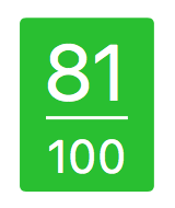
That was a huge bump for such a small job! We could stop here, but in for a penny in for a pound. What else can we tackle?
Service Workers, how hard can it be?
Service workers essentially act as proxy servers that sit between web applications, and the browser and network (when available). They are intended to (amongst other things) enable the creation of effective offline experiences, intercepting network requests and taking appropriate action based on whether the network is available and updated assets reside on the server. They will also allow access to push notifications and background sync APIs. – MDN
This is probably a bit more complicated than a json file … Sam (mainly) and I tinkered some time with this but in the end we decided on using a premade Service Worker from Chris Coyier.Our version can be found here.
This Service worker has a nifty caching implementation(for mobile and desktop) that supports offline browsing on you mobile device.
Report time! report
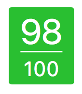
Can we push it to 100?
In our case … sadly no.
Our biggest problem here is that big map at the top of our site. It’s not really open to modifications. We could rewrite it ourselves, but that would bring us too far into this 4 hour experiment.
We have also decided to rework our homepage, when we do this we’ll probably keep a keen eye on our PWA score so we can finally grab that 100%!
What else did we get out of this?
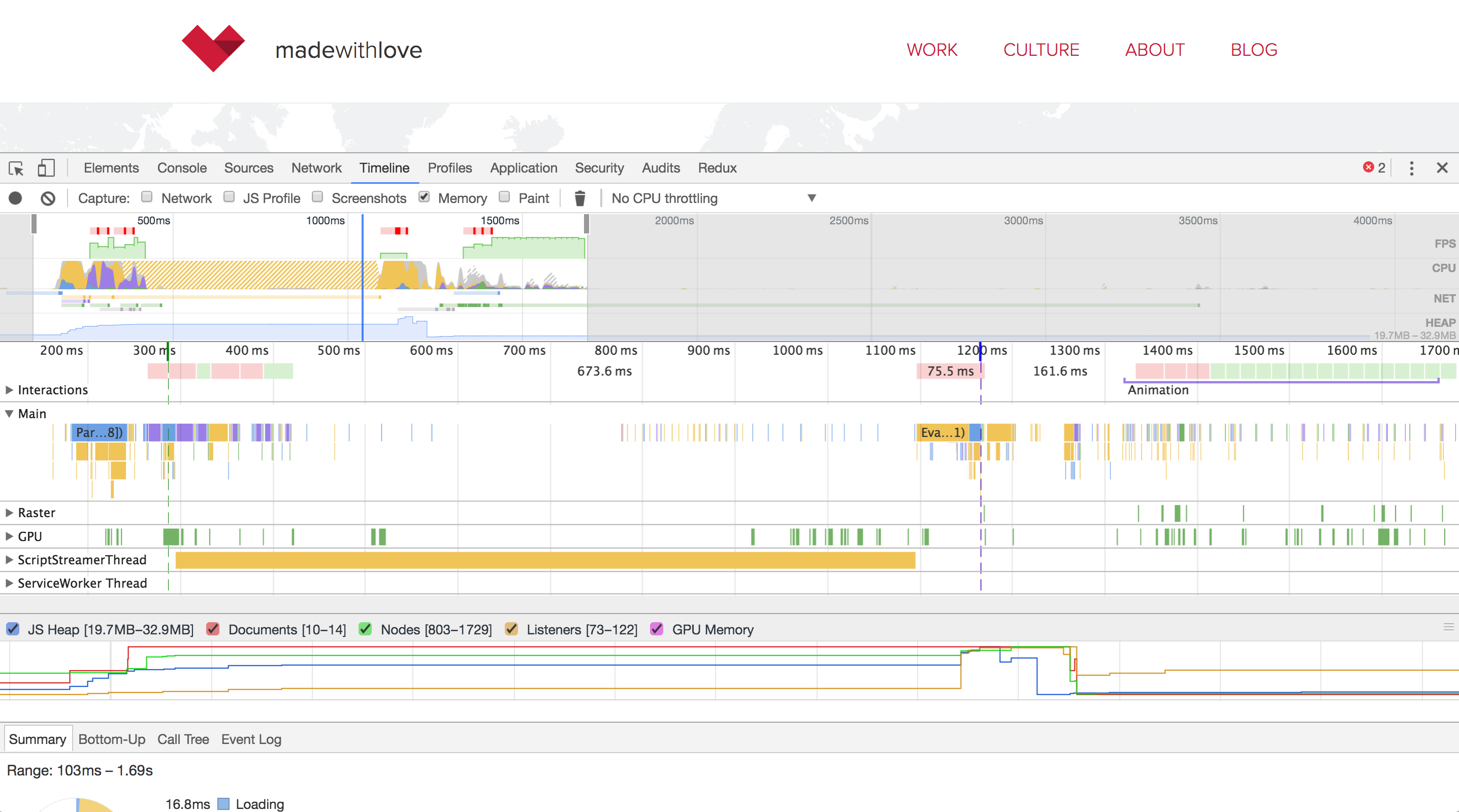
Something we didn’t really anticipate was the nice speed increase we got. This is of course due to the Service worker and its caching methods.
Checkout these before and after images:
Conclusion
I was actually really surprised how easy this was. We got an almost perfect score in a short time experimenting with that spec. The results are also pretty amazing, we now have something that feels like a native app, a nice bump in page speed and some extra SEO points, just by adding 2 files.
I totally advise you give this a shot, maybe you can even push it to 100%!



Member discussion